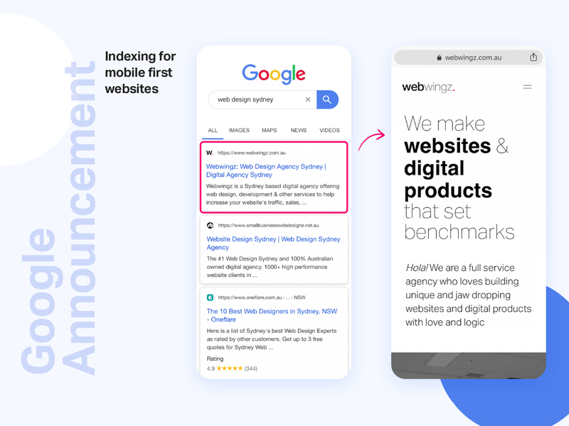
From July 1, Google announced that all new websites will be ranked on search based on how well it is designed for mobile devices. It’s called Mobile-first indexing.
Although this update will preliminarily affect the new sites that are launched from July 1, the old sites will get a grace period of couple months to join the race.
Google wrote “mobile-first indexing will be enabled by default for all new, previously unknown to Google Search, websites starting July 1, 2019. It’s fantastic to see that new websites are now generally showing users – and search engines – the same content on both mobile and desktop devices.”
Only new sites will be indexed using mobile-first indexing by default. Older sites not yet mobile friendly, will continue to be indexed by desktop-first indexing, until they are ready.
“For older websites, we’ll continue monitoring and evaluating pages for their readiness for mobile first indexing, and will notify them through Search Console once they’re seen as being ready,” the spokesperson from Google said.
“Since the default state for new websites will be mobile-first indexing, there’s no need to send a notification,” Google said.
What is mobile-first indexing?
Mobile-first indexing is simply how Google or any other search engine crawls and indexes the web. Google gives priority to index the mobile version of the page than the desktop version. In more simple terms, Google is crawling and indexing your web page based on how it renders on a mobile phone versus a desktop computer. Now over 50% of what Google indexes is indexed over mobile-first indexing.
What does that mean for you? Make sure you build your websites with mobile first approach as 90% of your audience will be checking them on their phones first. Mobile first may not necessarily mean mobile compatible.
There are several factors you may want to consider:
Many places around the world still have 2G and 3G connectivity. By keeping well navigated content and implementing smarter page loading, you can overcome speed issues. Optimise images and videos. Aim for images and videos to be less than 50kb and 1mb each respectively.
Users browsing websites on mobile are time poor and want everything fast, on the move. Try keeping your content simple, straight forward and brief. Here’s a secret. Try and keep most of your content under three scrolls and three swipes.
If you’re an eCommerce, minimise clicks to get to cart and checkout page. Using express checkout could save minutes of your customers time filling name, address blah blah. Use sticky filters on listing pages and remember shortlisted products to save the users some time. This will drastically improve overall user experience. I love how we’ve practiced this approach in Framesbuy.
Along with optimising images google now recommends us to caption them sensibly. Image indexing is also extremely critical and most certainly helps overall ranking of the site.
Login to your Google console frequently to check messages from google if it has moved your site to mobile-first indexing or know googles last crawl on your website.
Takeaway? From now on if you launch a website that does not work well on mobile, it may not rank for important keywords even if your competition is low.
Is your website designed with mobile first approach? If not, its time we get in touch.


