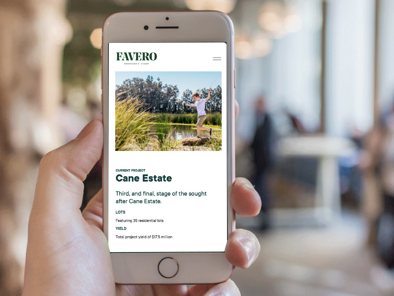
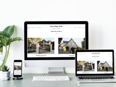
It’s an era where ‘size does not matter’! Well, here we are particularly talking about digital device screen sizes.
Market is flooded with mobile devices of varied screen sizes. To match up with the multiscreen world, mobile-first design is simply a no-brainer move.
Mobile-first design is an approach to make sure the web design looks and functions appropriately irrespective to screen size. More than a trend it has become a necessity to create user-friendly web presence for the mobile world.
Since fitting in the content on small screen is a bit complicated, it is wise to design as per small screen limitations and then move ahead with bigger device as it’s easier. This process is known as progressive enhancement.
How to get going with mobile-first approach?
Focus on the most important content:
Content is the heart of any website. Since you have restricted space on mobile device, make sure you pay attention to content that is pivotal for the targeted audience. The content which you put on center and front should be attention-grabbing as well as user-focused. Do not try to squeeze in loads of content within the confined space. The most important content should be on top, following the linear model.
Navigation option:
Easy navigation should be on priority while following mobile first design style. Too many menu layers and clicks is a big no. Short and sweet is the golden rule. Make your navigation intuitive, it should be clear and ensure to limit scrolling and clicking.
In case of multi-tier navigation, avoid mouse over effect for dropdowns. It should be touch-friendly which means you need to touch to activate. Build navigation keeping customer in mind; help to move in right direction. In short, navigation should be clear, touch-friendly, accessible and placed consistently on all pages.
Watch out for page load limitations:
Opening a heavy website on mobile screen can be problematic due to the bandwidth constraint. Speedy page load is expected by almost every user as hanging up for long time can be frustrating. Save page loading time as much as possible. To keep the load speed on track, use lighter images or optimised images. Reduce the usage of big javascript libraries. For styling feature use CSS instead of images. Keep your CSS smaller and cleaner.
Get rid of major UX issues:
Mobile first design is specifically followed to enhance user experience but if you do not follow it in right manner, it can have drop the number of users. According to the web giant, Google has listed down few mistakes you need to avoid while carrying out mobile first approach. Google itself scrutinises your mobile website.
You need to:
action buttons)
There is much more to mobile first approach. However the main aim is to offer interactive and pleasant experience to the users. Put it into action for elevated traffic.


